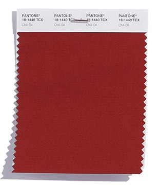
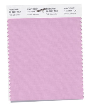
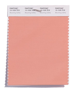
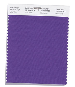
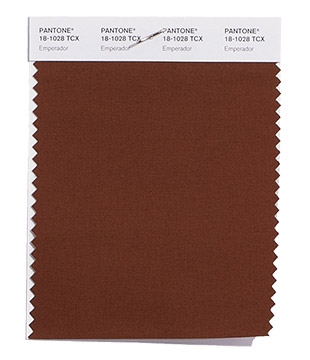
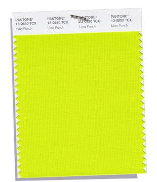
When certain colors are trending in the fashion world, they eventually make their way to the world of paper, and predicting what 2018 Pantone colors will take the fashion world by storm ultimately affects those of us at the stationery level.
Persnickety is always watching what’s trending in stationery, and we are absolutely thrilled with what’s up-and-coming for next year’s wedding season. Many of our brides like to stay ahead of trends so they can add just a touch of what’s popular as an accent color in their paper suite or as a complementing color in their wedding decor.
Both fashionistas and brides are incorporating more and more color into their personal styles, and the forecast for the 2018 invitation color palette is everything from bright and bold to subtle and soft.
There are mixtures of earthly elements with distinctive, loud tones; each color having a personality of its own. These colors are definitely standing apart from 2017’s Color of the Year, Greenery, especially with more sharp, neon colors. There’s no other way to say it: using these colors in your paper suite is the perfect way to stand apart from the rest.
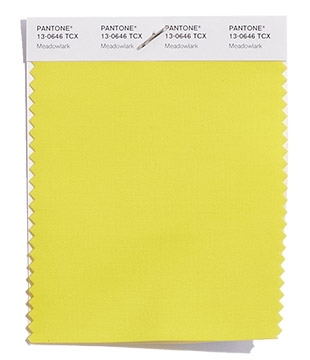
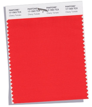
And with that, we are pleased to present the trending Pantone colors for the 2018 wedding season.
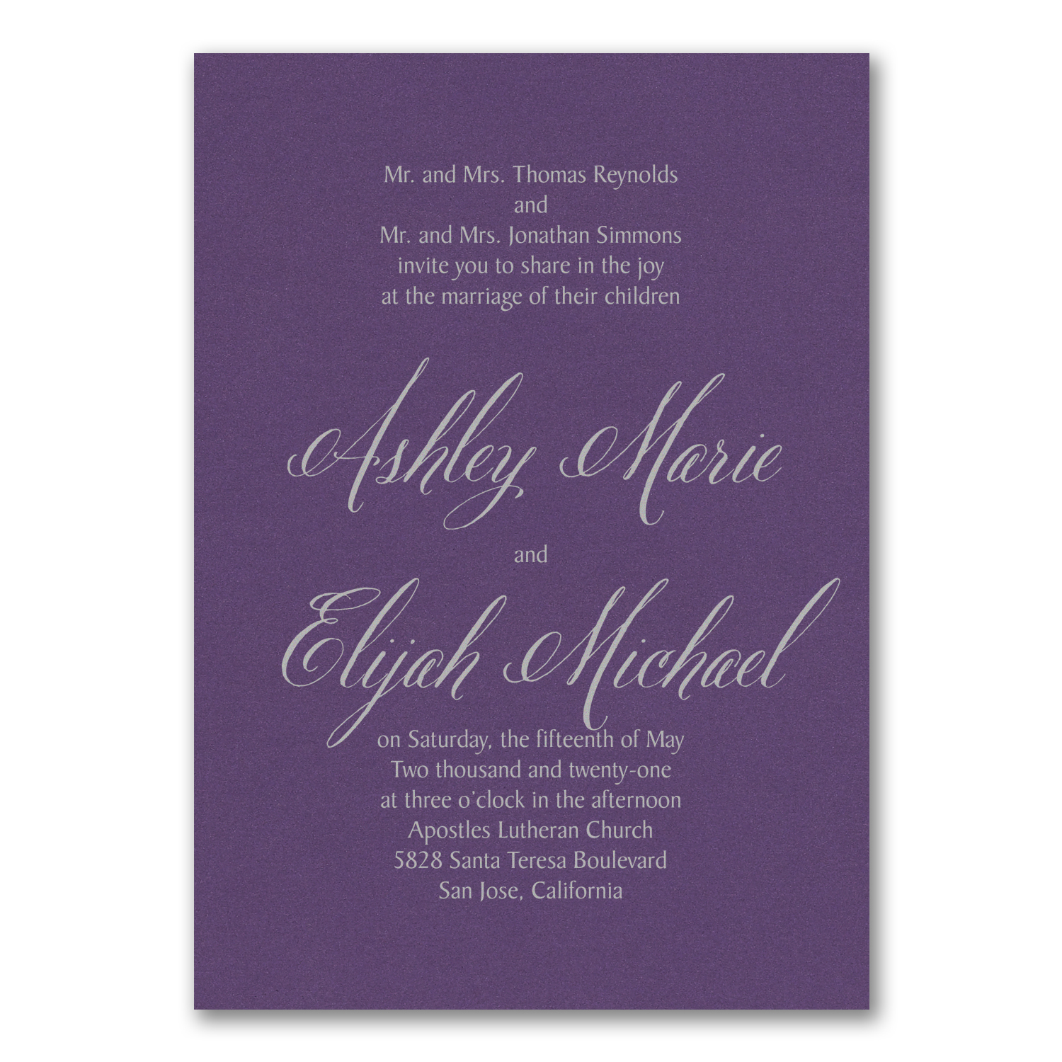
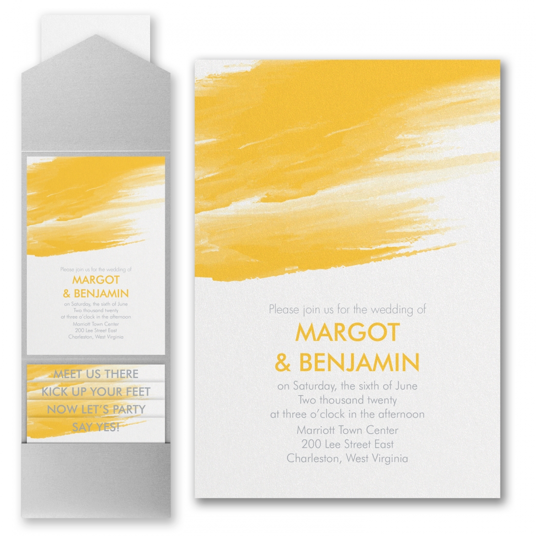
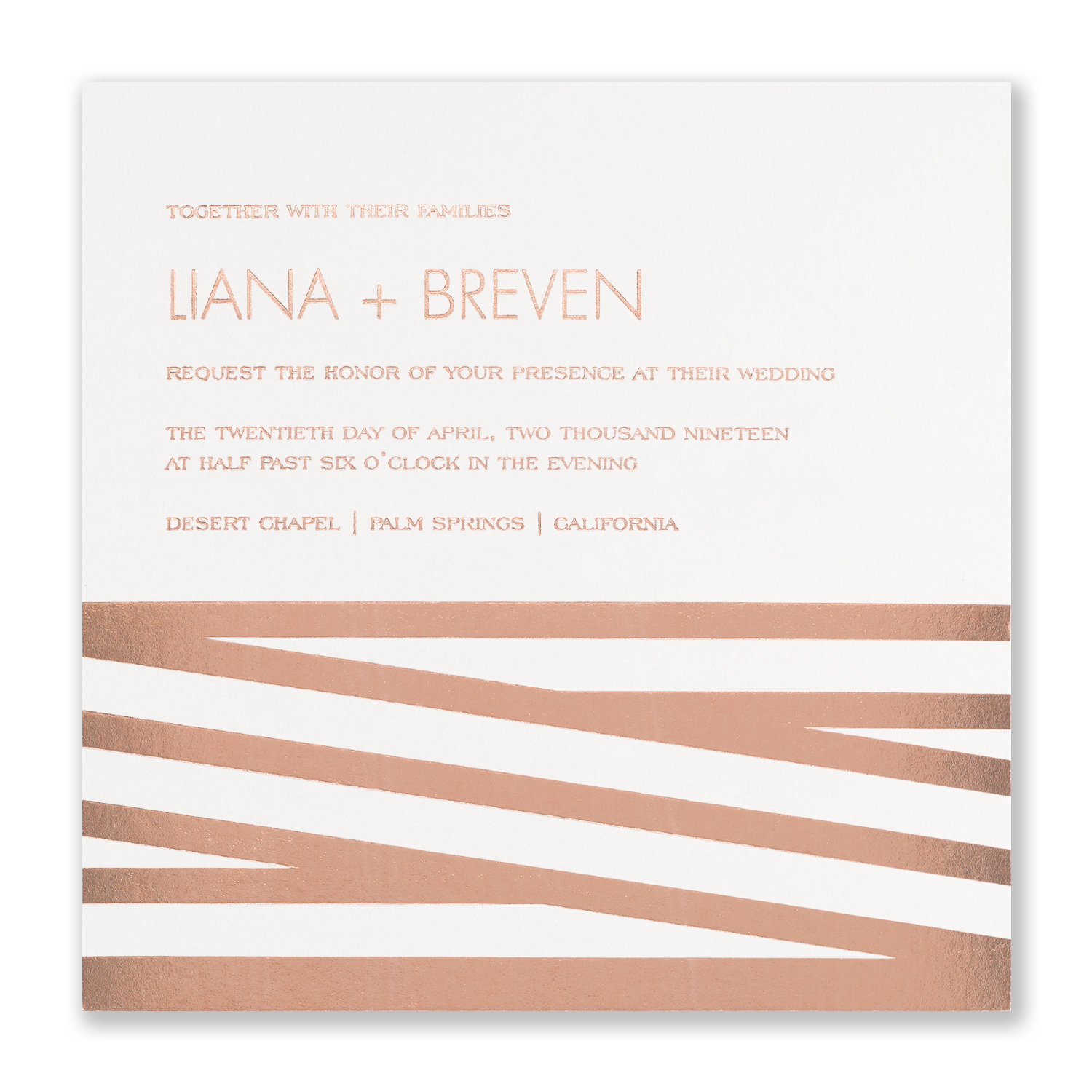
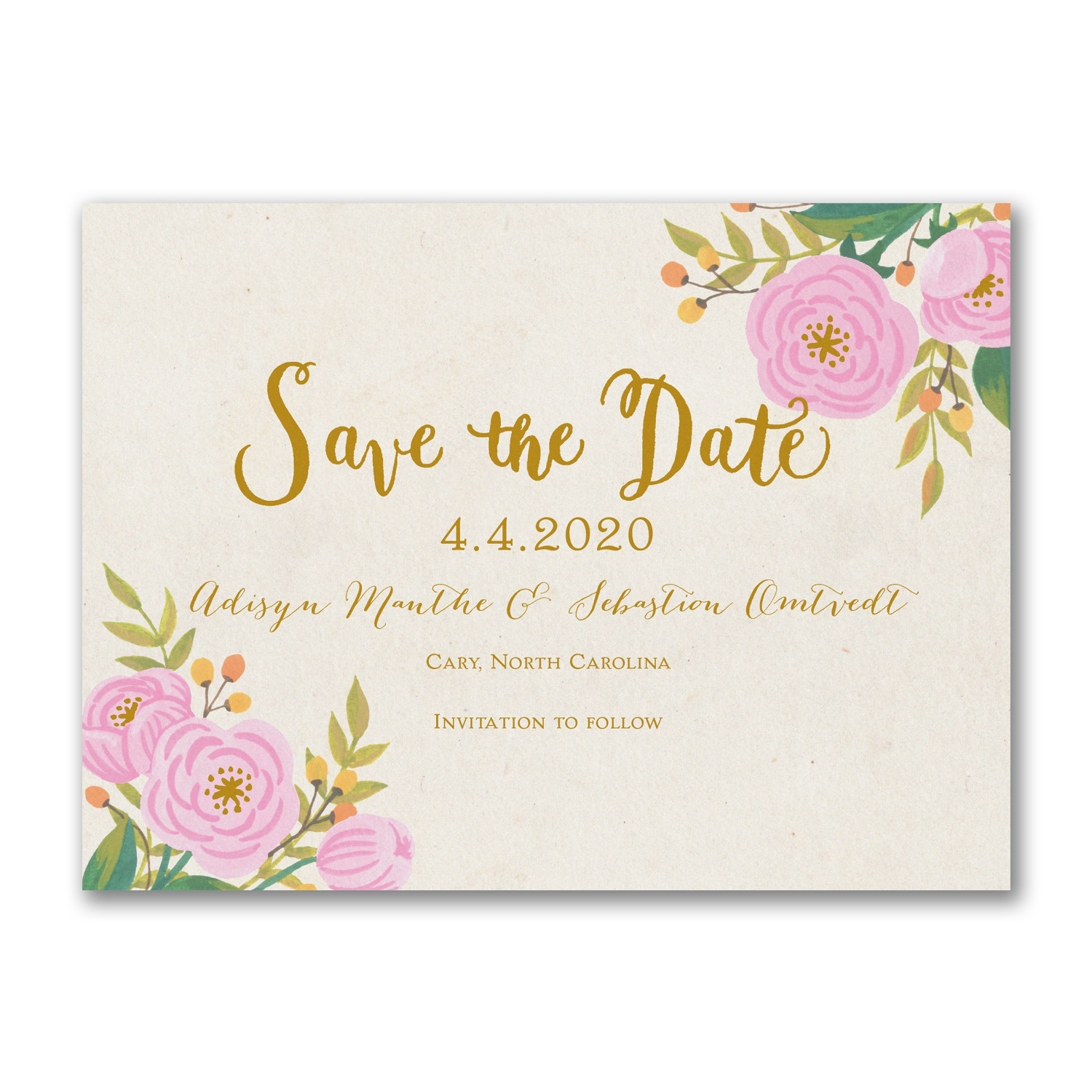
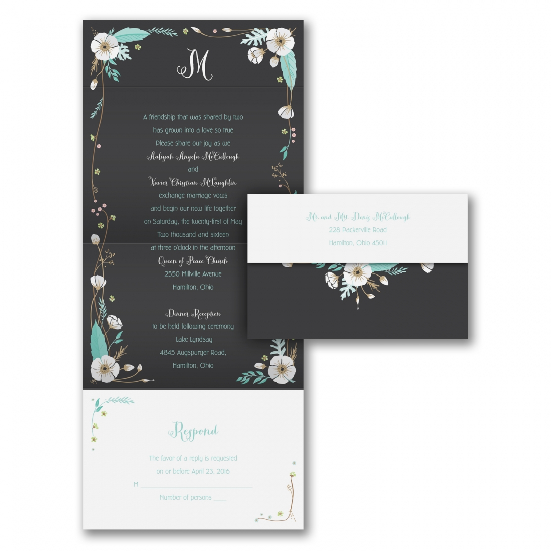
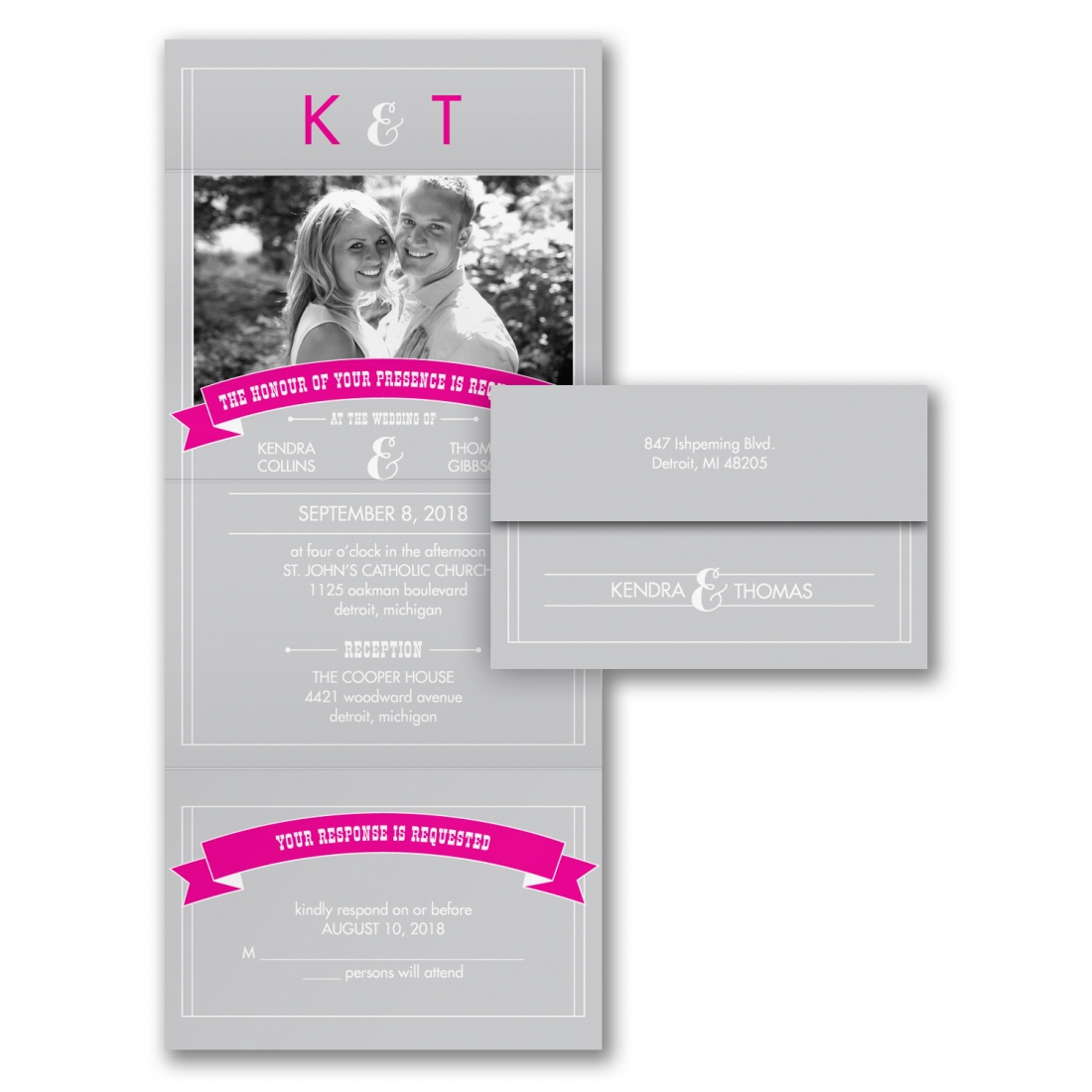
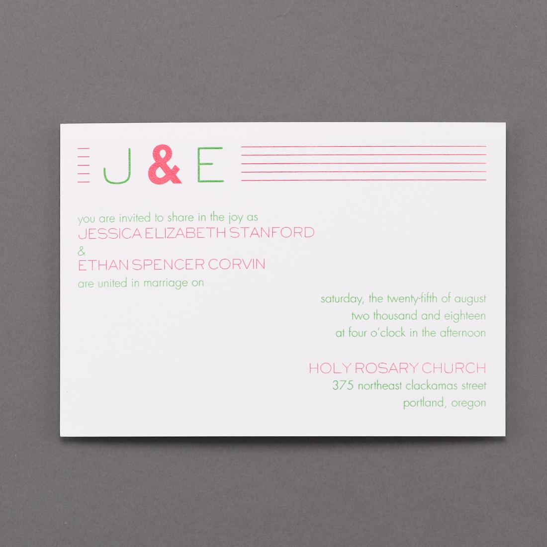
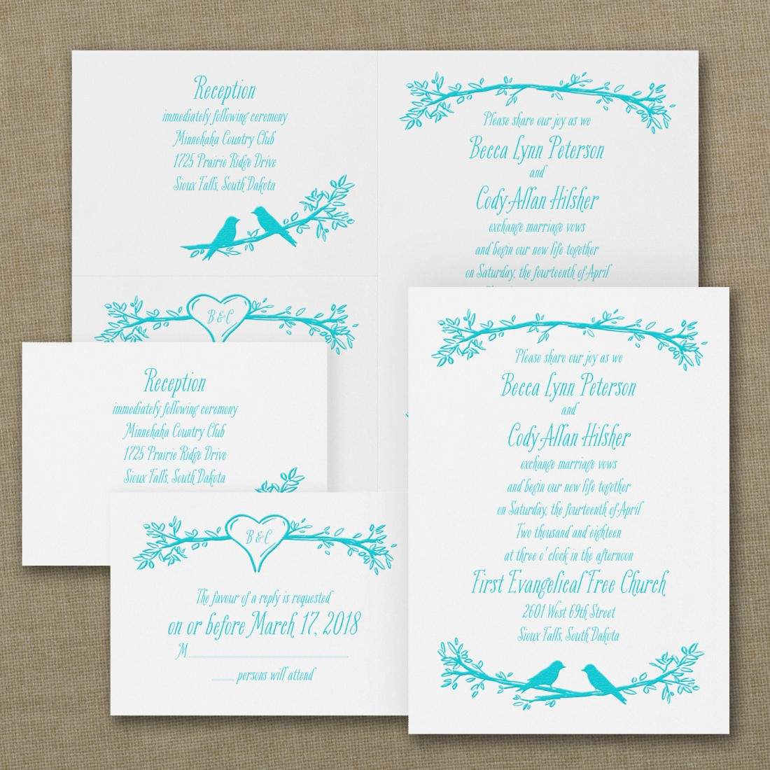
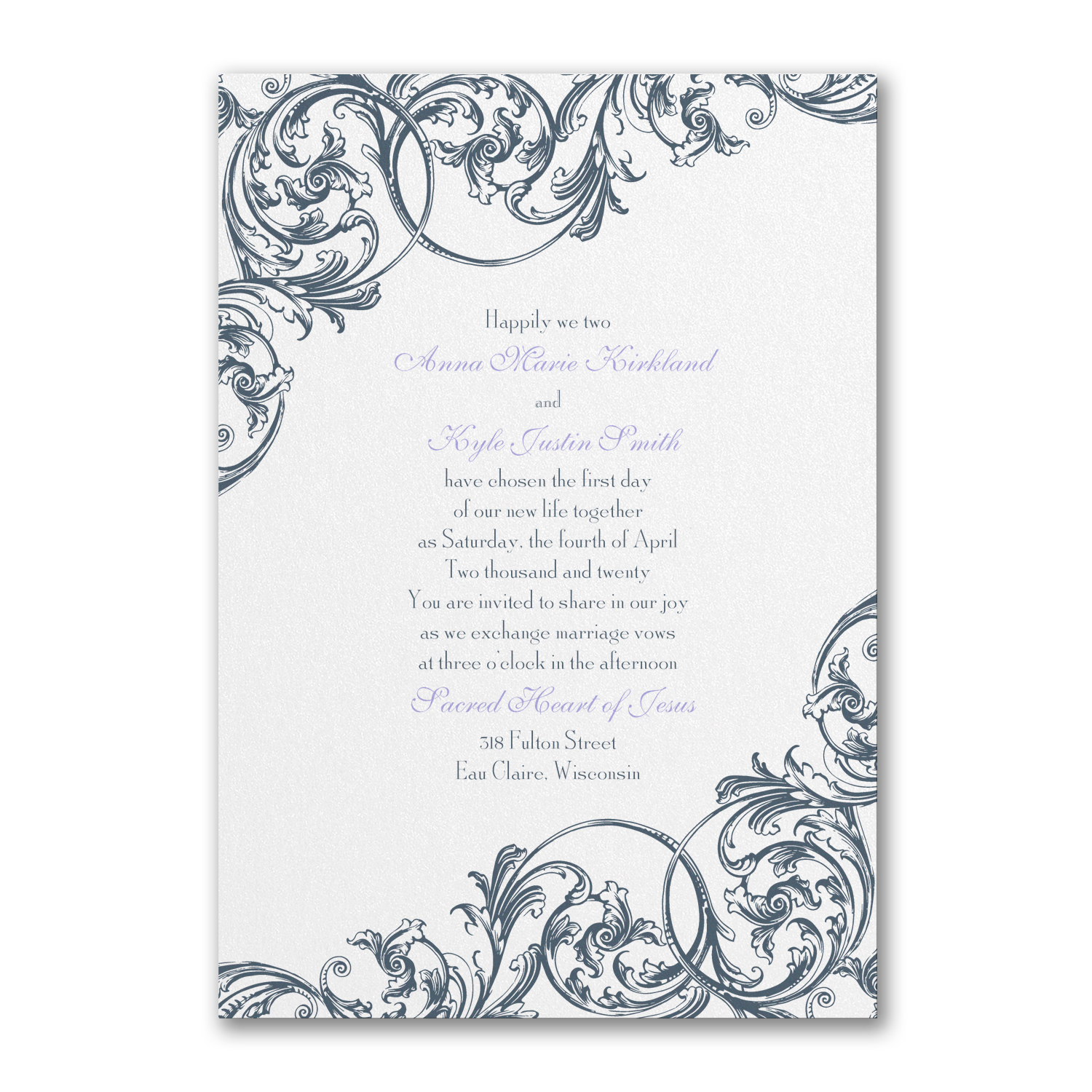
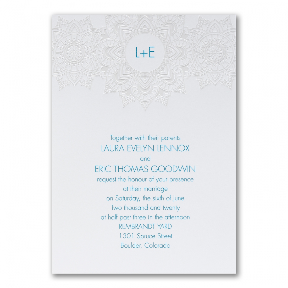
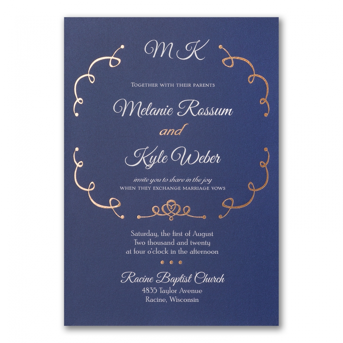
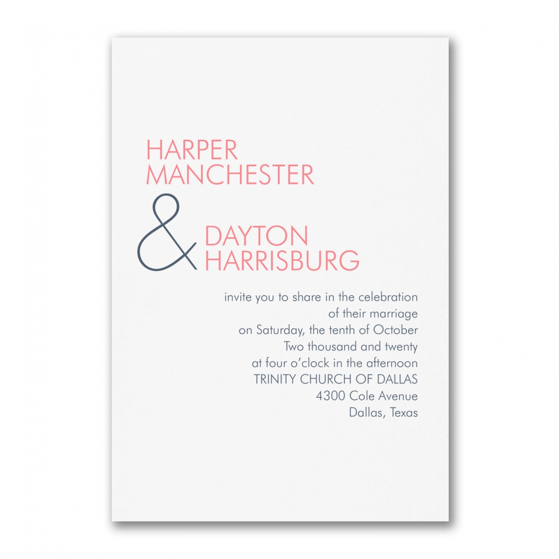
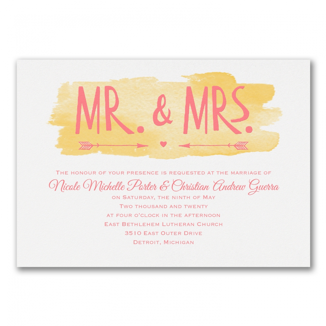
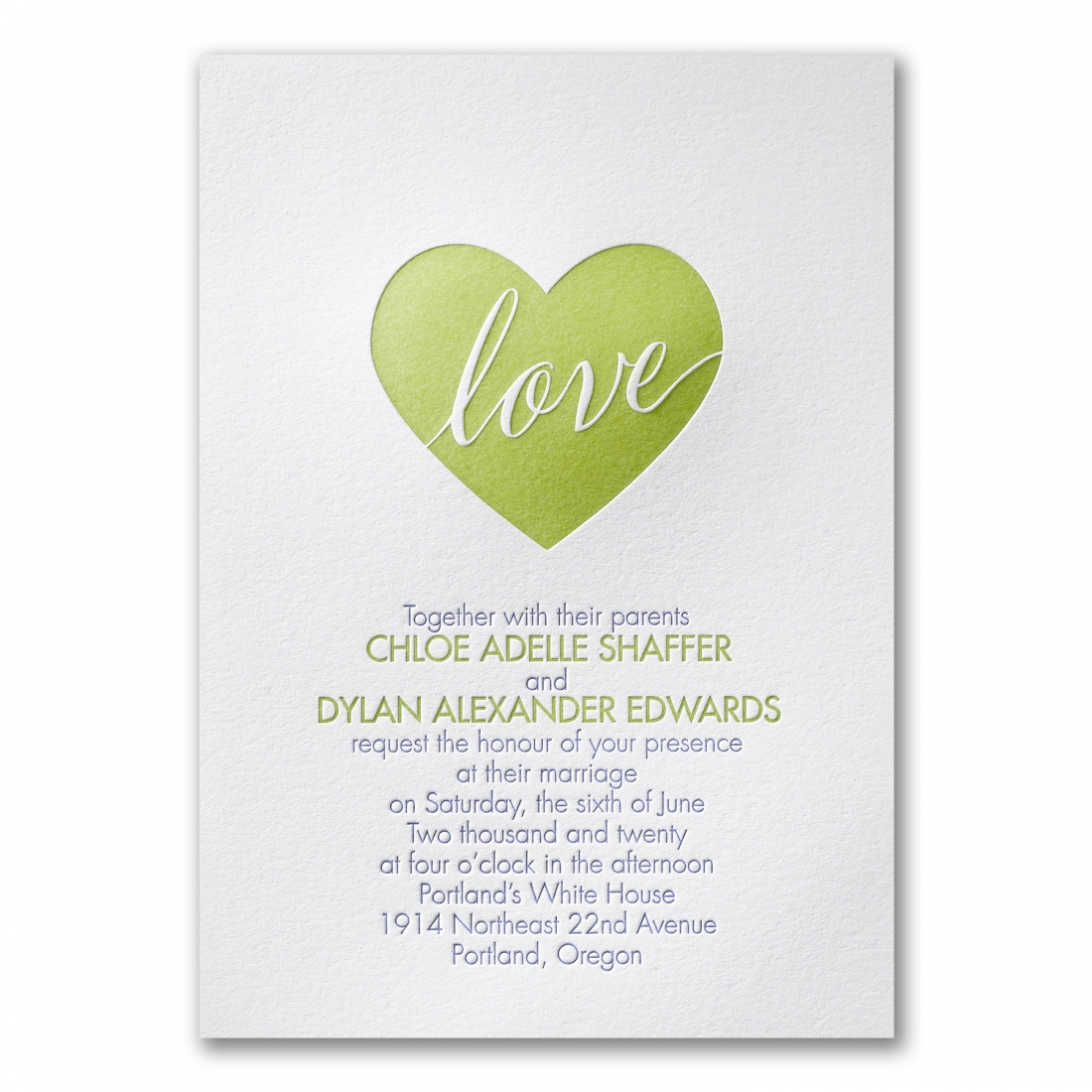
Some of these colors have already begun popping up in a few of our stationery lines. We combed through some of our favorites from our Carlson Craft collections and found just a few invitation designs that are incorporating similar colors and tones. Check them out below!
Are one of these designs trending for you? Let us know! Schedule your appointment with an invitation specialist here, and let Persnickety walk you step-by-step through finding the perfect Pantone approved paper suite.

